DELL
Latitude E-Series | Modernizing Enterprise
THE ASK
Dell engaged Pentagram to redefine the design language of the E Series Latitude notebook family, one of Dell’s most popular and enduring enterprise notebook lines. The goal was to craft a modern, refined aesthetic capable of competing with the rapidly growing Apple PowerBook line, while preserving the E Series' legacy of reliability and strong appeal to enterprise customers. @Pentagram
-
We developed a modern, expandable design language that transformed Dell’s most popular enterprise notebook family from a standard business tool into a minimal and refined, sought-after productivity device that helped grow market share and establish Dell as a design conscious brand.
-
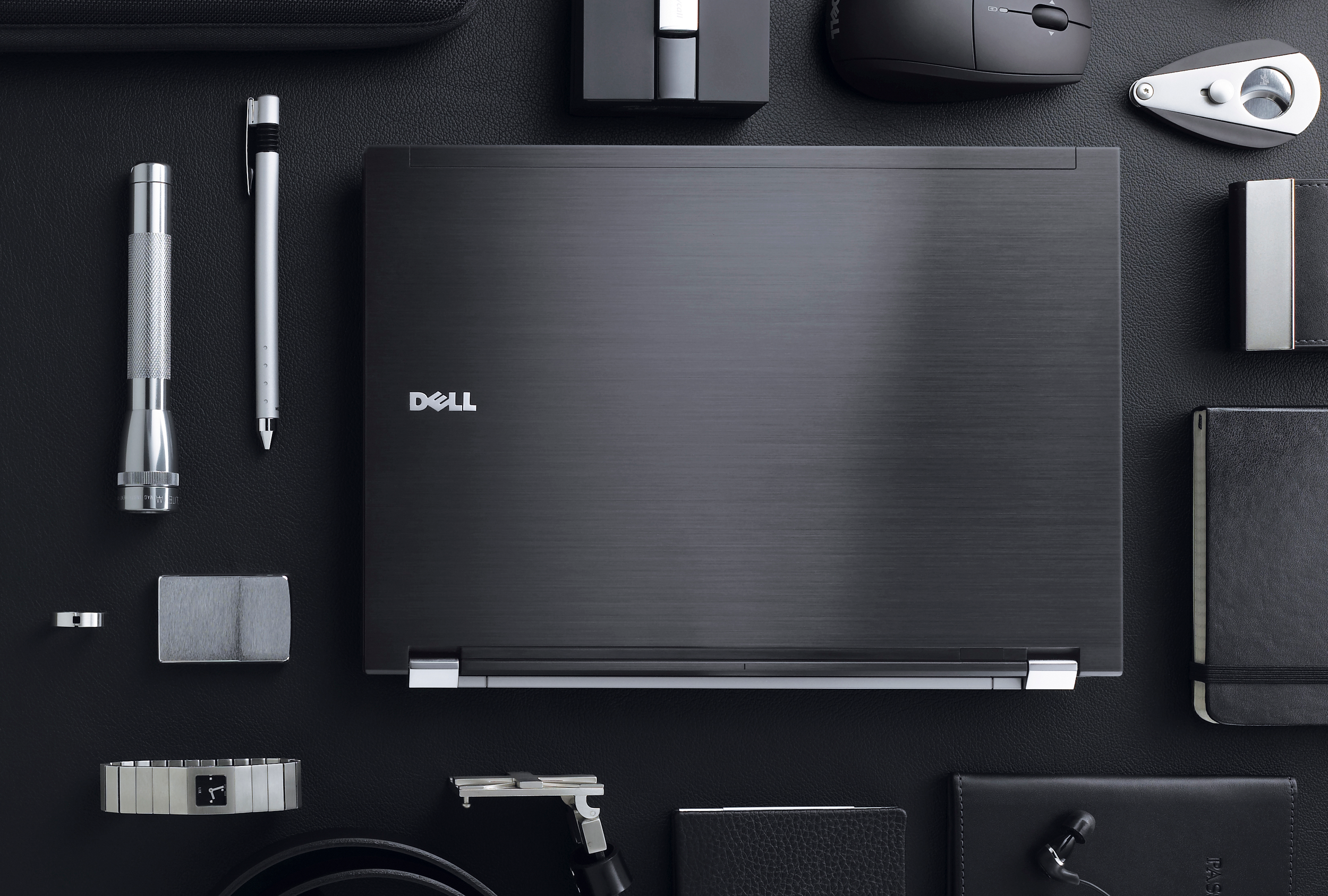
I never liked Dell’s centered circular logo badge on their laptops, so I proposed offsetting it as part of Latitude’s new design language. Critics scoffed at changing such a “legacy” element, but it was ultimately adopted for the E-Series and later carried over to the Precision line of notebooks.
-
I was responsible for generating multiple design language concepts for Latitude and ultimately defining the selected direction. I supported the process from sketch ideation through CAD refinement and renderings.
APPROACH
Analyze the assembly and construction of the existing Latitude notebook to identify opportunities to reduce visual clutter, such as exposed screws, streamline overall thickness, and establish a clean, minimal design language that supports user productivity.


Comparing Original vs. Redesigned
We focused on reducing visual clutter, cleaning up part breaks and better organizing port locations to seem less like an after thought.


Concept Renderings


