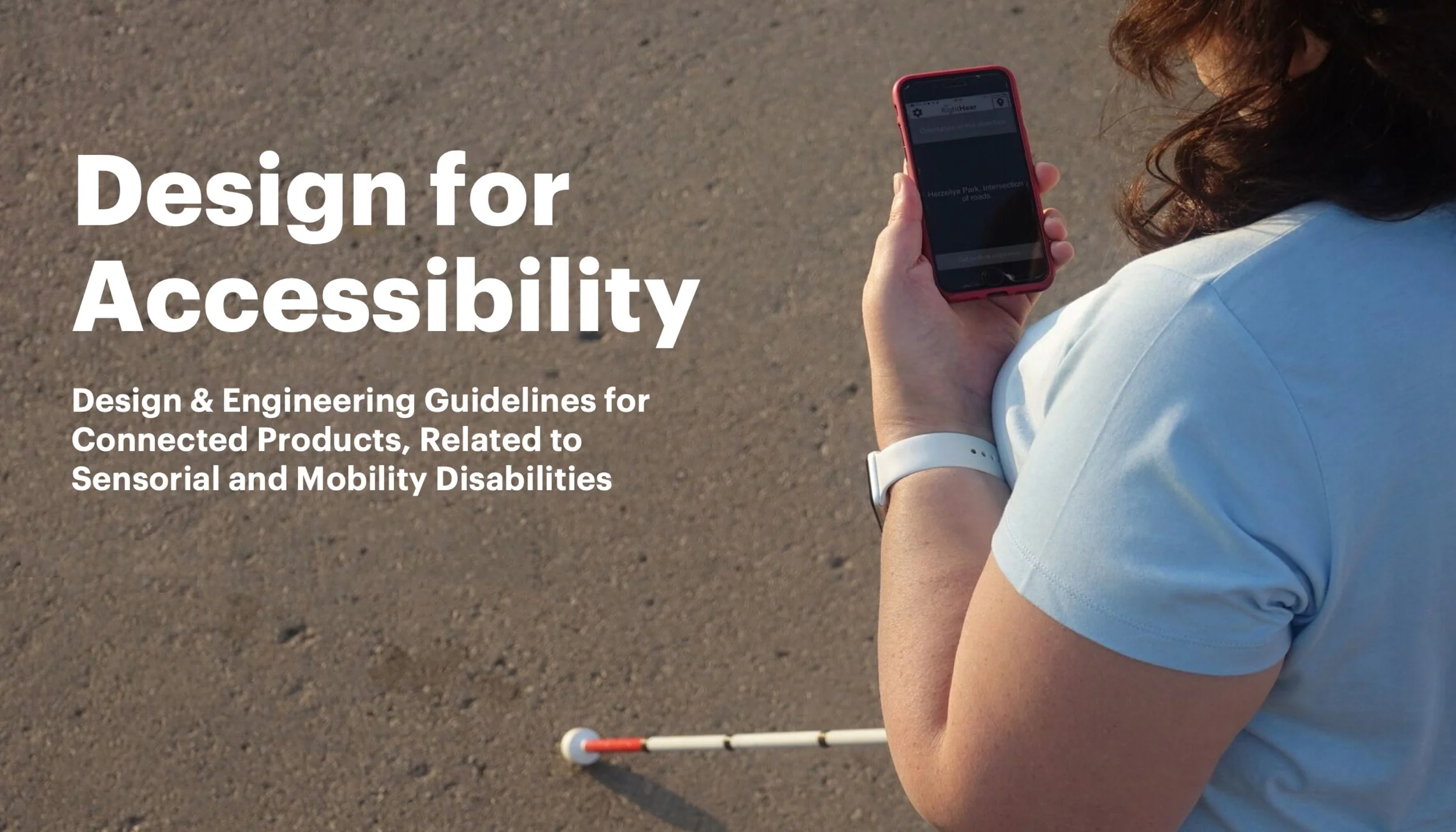
Design for Accessibility
Design Guidelines for Connected Hardware
THE ASK
At Accenture, accessibility-for-all was a core business objective for many of our clients. As one of the world’s leading technology companies, designing for accessibility should also be a moral obligation. However, there are no accessibility standards for designing physical, connected products and spaces that exist within a service ecosystem. How do we make thoughtful design and engineering decisions when there are no guidelines? We create our own. @Accenture
-
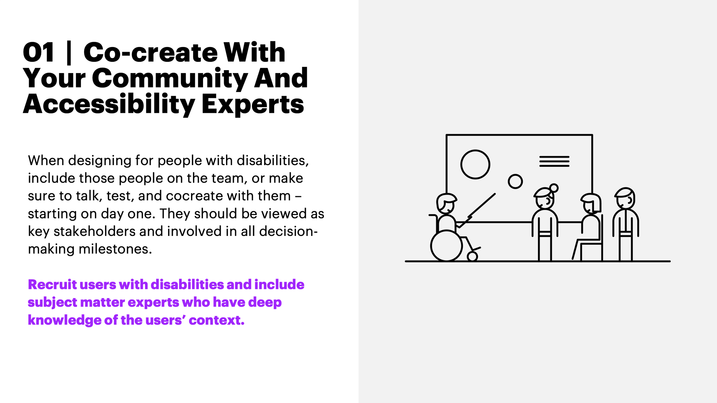
We created comprehensive hardware accessibility guidelines for engineers and designers new to accessibility principles. Centered on six foundational principles, the guidelines support decision-making at every stage of design and development. Beyond instructions, we provided context to highlight the importance of accessibility and inclusive design. As the first initiative of its kind at Accenture, this effort showcased our team’s dedication to advancing hardware accessibility across a global workforce of 750,000.
-
“Justin’s dedication to practicing and educating his team on inclusive design principles is apparent, and how he speaks to the value and need to broader audiences is compelling and infectious.”
-Accenture Industry X Managing Director
-
As a passionate advocate for accessible design, I conceived and led this initiative at Accenture. Despite limited resources - just six weeks and one senior designer - I secured funding and created a concise, impactful guide. The result empowers designers and engineers to approach problem-solving with greater empathy, fostering more inclusive solutions.
APPROACH
With limited time and resources, we focused on mobility and sensory disabilities, drawing inspiration from industry leaders like Microsoft, Apple, and Google. By aligning with established digital guidelines like WCAG, we reinterpreted core accessibility principles for hardware, grounding our design approach in proven methodologies. Below are screen shots from the Guidelines, to access and accessible PDF, please link: Design for Accessibility
Sample Pages


I wanted to create an easy-to-understand set of guidelines that gave our designers and engineers tools and insights for making inclusive-driven design decisions.